 Those Shindigs Where You Really Need Them
So about two weeks ago I found myself in Burbank, CA for the WWRS 2019. The event was held on top of what, as an East Coaster, I can only describe as a mountain with amazing views of the Los Angeles area. It was the perfect setting for the radio world schmooz fest that was three days of enrichment, professional development, and networking at every turn. To say that for professional voiceover actors (and my guess is that there were about 50 of us there) business cards were essential is an understatement. The whole point of going was to put ourselves in front of the production managers and creative directors who make the decisions about which voiceover talents to use.  And aside from our amazing in-person impression, all we leave them with, in the end, is our tiny little card. I found my self extremely curious about the cards that other voiceover talents were giving out and it made me re-evaluate the ways in which I was using the precious space on my own card. I was standing there in gorgeous Burbank at this conference looking at the card in my hand and questioning, is my card sufficient for the major purpose it serves in life?
Breaking Down Current Trends
According to The Balance Small Business, even in the digital world there is still a cultural precedent to the exchange of business cards around the world: “The ritual exchange of business cards is central to establishing business relationships in many countries. In Hong Kong, for instance, if you are given a business card and don’t offer one in return, you can basically close up business then and there, says Rory Boland in Hong Kong Business Card Etiquette. In Japan, too, the quality and condition of your business card speaks much about how you intend to conduct yourself and business.” Most professional voiceover actors like myself use their business card as an extension of their branding. It matches their website and other marketing materials in both font and colors. Everything ties together and it is what a client familiar with your brand would expect to see. Another current trend a lot of my voiceover friends, including me, had been encouraged to follow is to only have our name and maybe a tagline if anything else on the back of the card so that folks that we meet have a place to write down notes when they meet us. Here are some examples of this. Accomplished voiceover talent Dervla Trainor has beautiful cards that match her site in color, font, and follow the trend of leaving space on the back side:


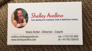
In another example, accomplished voiceover actor, coach, and director Shelley Avellino follows this branding trend as well. Shelley had the clever idea of only having the front of her card glossy and leaving the back matte so that folks have an easier time writing on it:


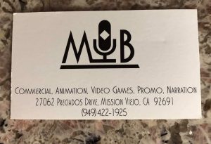
This year’s VOA unicorn award recipient Michele Blenker has a little more information on the back of her card while still tying in her branding and leaving space:

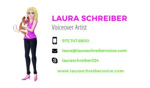
Here is what my card looks like at the conference:


What Am I Trying to Accomplish
What I realized at the WWRS 2019 was that there were a lot of voiceover talents who were thinking outside the box. Some had a list of top stations they were doing imaging for. Some had a list of major brands they voiced. I could do this! Bells started to go off in my head because I suddenly felt concerned that this side of the card was my bill board and I was leaving it blank. Yes, there are a lot of well-established successful voiceover talents doing the same thing I have been doing and their cards look beautiful. But after seeing these other cards, instead of leaving it to the folks that we network with to write down the information that resonates with them, it occurred to me that I can take control of the dialogue and use the space in a way to make sure that potential clients and current clients have essential information that I want them to have. Yes, I realize this goes against a trend. And yes, I realize it looks cluttered. And yes, I realize it is not as pretty. But, once I saw these other cards, I had this real conflict as I could not unsee them.
My Bold Move
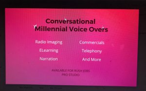
I should note in my passionate tirade about the cards that I have different cards for different genres of voiceover. So, I have one set of cards for eLearning. I have another set of cards for government contracting. So this set I am all fixated on is for my radio imaging, commercial, telephony sort of work. I decided to do an experiment and actually ask for feedback. This week upon my return I did ask for a revised design from the team at voiceactor websites for the back of my card. This is what they came up with:

I chose this because I wanted to clearly state which genres I work in most. I wanted to remind clients about the studio I have worked so hard to build. And I do actually do RUSH jobs all of the time, so I felt that it was essential to put that on the card. Am I certain that this is the right move? No. I am pleased that it is clean and easy to read. I am pleased that I can be sure clients will have the information they need. But when I look at my friends’ cards, they sure do look pretty.


