Why Did I Need A Change?
As a professional voice over actor, I think a lot about the vibe that my clients and my industry friends get when they visit my website, my virtual storefront. Back in 2015, I worked with the amazing Anne Ganguzza and Sara Waters to come up with my original branding. I loved it. As a new business, it was the perfect look. It was refreshing and upbeat. The colors were spot on and it was timely. I was building my body of work, and for a while the site worked perfectly.

I worked with a separate graphic designer to do my first logo. I had heard from lots of people in the industry that having things like a microphone in your logo was very “over-played.” At the time, I listened. I went for a simple logo that matched my branding. The problem was that I never loved the logo. I never loved the font. I soon realized I never loved the font on my website, it just did not feel like me. So I chose a different fond on my logo, but I too felt like that was just off. For years I chose to only have my logo on items like invoices and rate cards, but nowhere else. It was beautifully done, it just was not me.
Over time, I am proud to have built a strong voice over business. As a working mom, I want clients to see the fierce passion with which I approach every project. While I am upbeat and happy, and do still love pink, there was an edge that my previous branding lacked. I almost felt that version was what you would expect if you know me briefly, but I wanted people to see all sides of me, so it was time to rebrand and really show folks who I am and what I have to offer.
Starting With My VO Logo
The logo redesign matters a lot to me. Just as often as I work with agents and video production companies, I am also often hired by law firms or accountants who need new phone systems or explainers and they want to work with me directly. I wanted clients who were in no way connected to VO to look at my logo and know what field I worked in.I felt very strongly about this. Frankly, if I could have had a microphone, sound booth, wave form, and headphones all on my logo I would have!

I had all of this in mind and had to decide who was going to do the work. I have had a very close friendship with my website team at Voice Actor Websites. If you know Joe Davis and Karin Barth, they are incredible people and very good at SEO. I had no desire to change that. While they do have artists on their team, I was considering bringing someone else on board. I just wanted something different. I began reaching out to lots of different folks. When I spoke to Sara Noto of Notobella designs, we clicked. She just got it and I knew I wanted to work with her on the graphic elements of the site. I connected Sara, Joe, and Karin, and we were in motion.
Sara was a delight to work with. She asked questions that no one else asked. She asked me what my favorite flowers were and what my favorite shade of pink is. I was elated. I knew the direction was the right one. She began sending options of logos, and I was so excited. We got where I wanted to be very quickly and from there everything fell into place.
Choice I Had To Make
 As I said before, there were elements of my previous branding that I loved. I loved a lot of the pink. I did not love the contrast between the pink and the black. Instead of the bubbles I had before, we whose to do something that combined my favorite flowers and leopard print. Again, I wanted this to have some edge to it, while retaining some warmth.
I was also worried about my SEO. The reason I wanted Sara to work with Joe and his team, was that Joe explained that any changes I made could effect my SEO, and that was frightening. So, every design element was made with SEO in mind.
It All Came Together
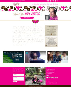
I am thrilled with how my voice over branding came together. As a female voice actor, it’s hard to come up with something new and different. There are so many great sites out there. I decided to be myself, despite the advice of some of the other designers I spoke to, and I am so thankful I did. There are some big changes on this site. For

example, the photos used were take in my booth when I was speaking at an eLearning conference via zoom last June. I love that they are action shots and I have my headphones on. The new picture on my contact page has both of my dogs and was take by my sister at my parents’ house in Philly where I grew up. I love this photo and it means so much to me. We also got rid of the sliders at the top which should reduce the load time. The other item that was eliminated was my instagram feed. I have mixed feelings about this, because I thought it was fun having it there, but I think it is more important to have a client-centered site and think about what they need to see when they are casting a new project.
Making changes can be hard. Everyone seems to have an opinion, even when you don’t ask for it. I think if you intend to re-brand, wait to make the investment until YOU know what YOU want. After all, the purpose of the brands is for you clients to know what makes you stand out from your competitors, so if others impose their opinion on you and their ideas take over, you will never get the branding you love.


